Autec
Year
2016
Agency
Freelance
Service
Branding & Identity
Industry
Mining Extraction
Toolkit
Illustrator, Photoshop
Project Overview
This brand concept was created for a gold extraction company called Autec. They focused on the development of flowsheets and processes to handle refractory gold ores.
Strategy & Design
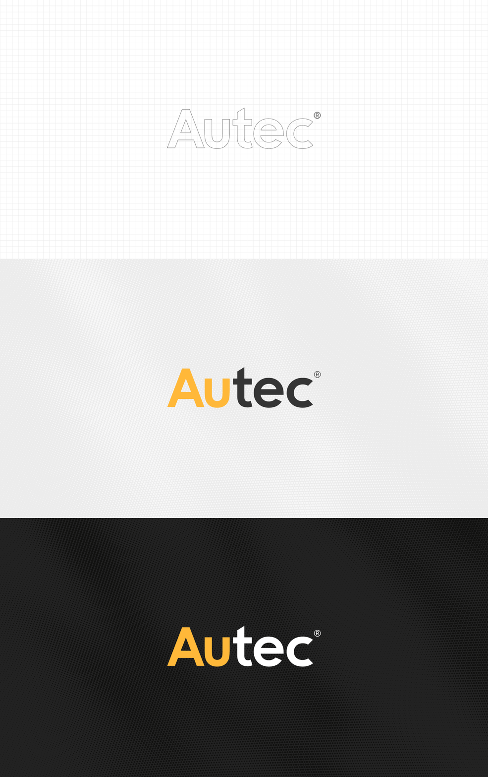
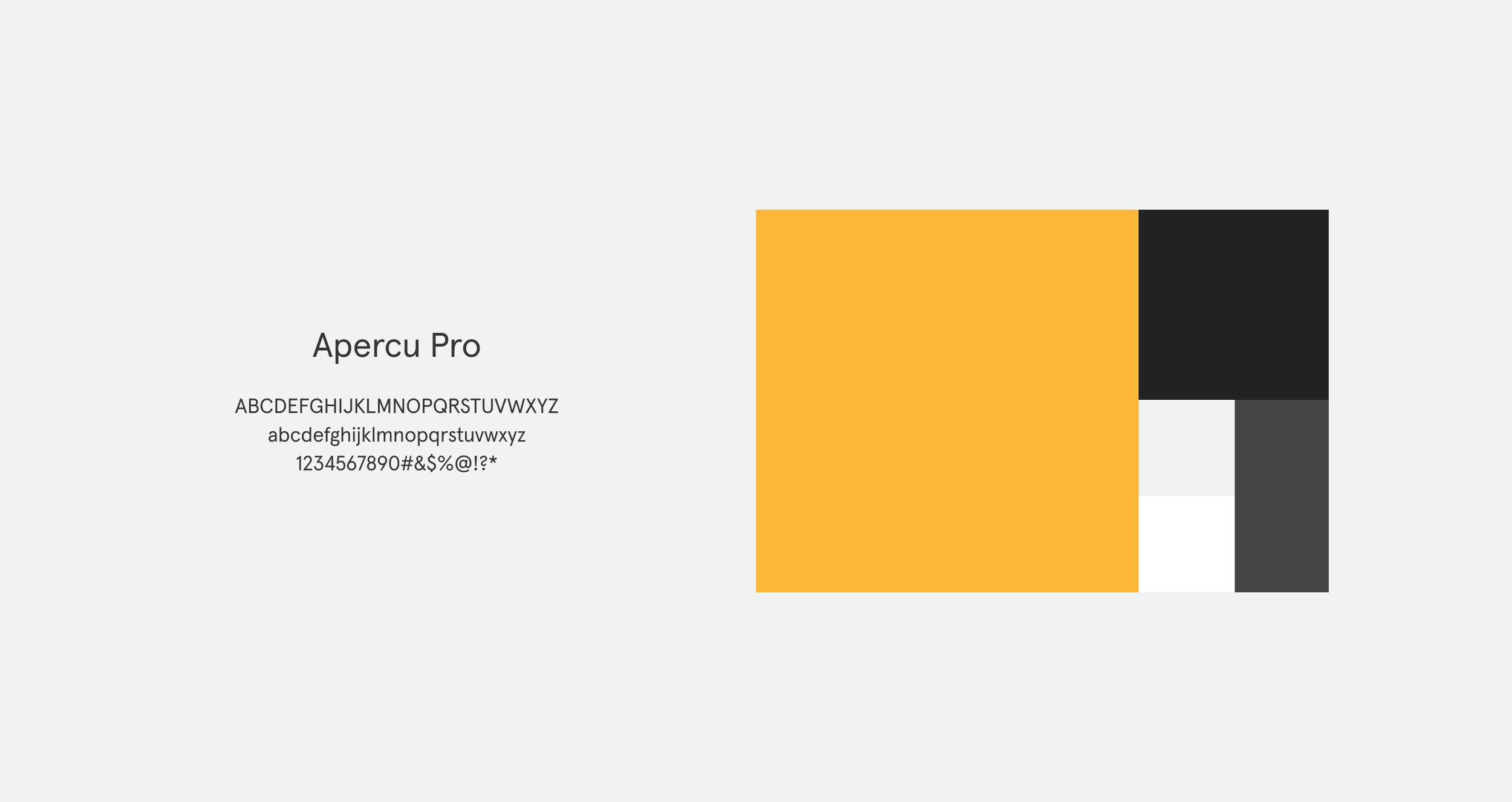
For Autec, the goal was to build a clean, refined brand that reflects their professionalism and a high-tech approach. I chose a bold, easy-to-read typeface for the logo so it feels clear and modern. The yellow accent nods to gold on the periodic table, giving the wordmark a unique touch. Paired with the typeface “Apercu Pro”, strong colour-blocking, immersive photography, and a tidy UI, this concept aims to move past the look of a traditional mining service to feel more like a modern, forward-thinking tech partner.
Deliverables
Logo Design & Brand Elements
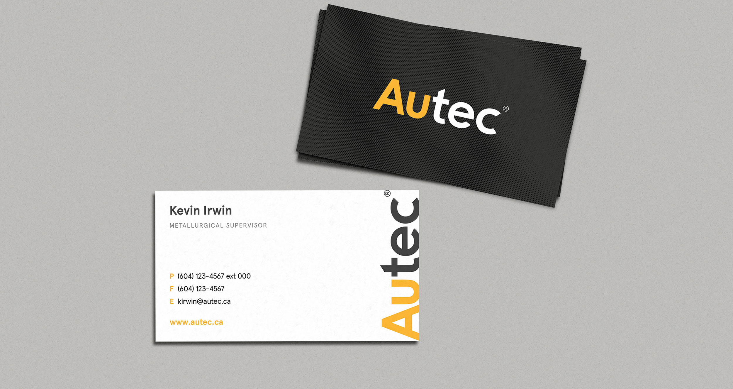
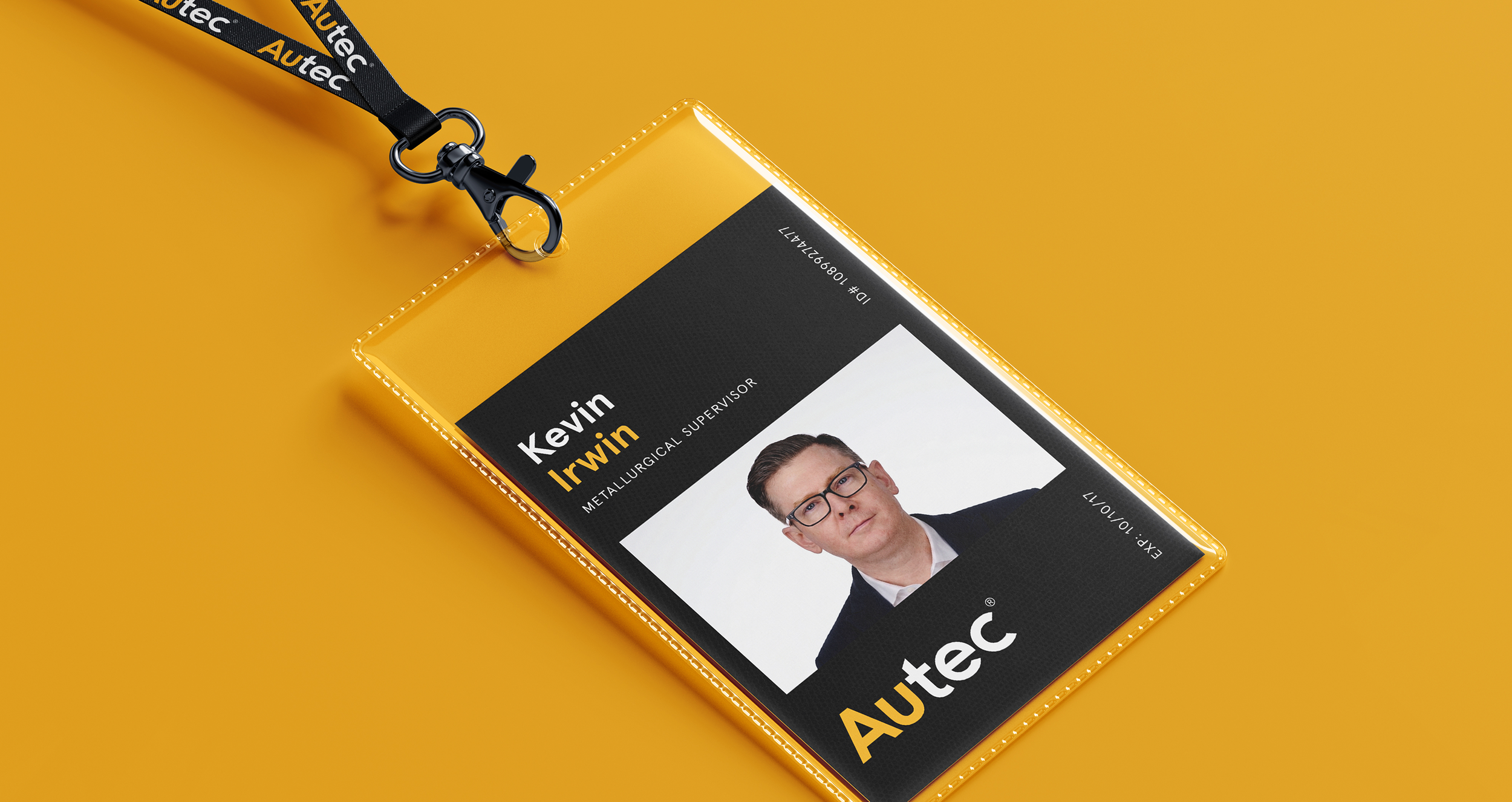
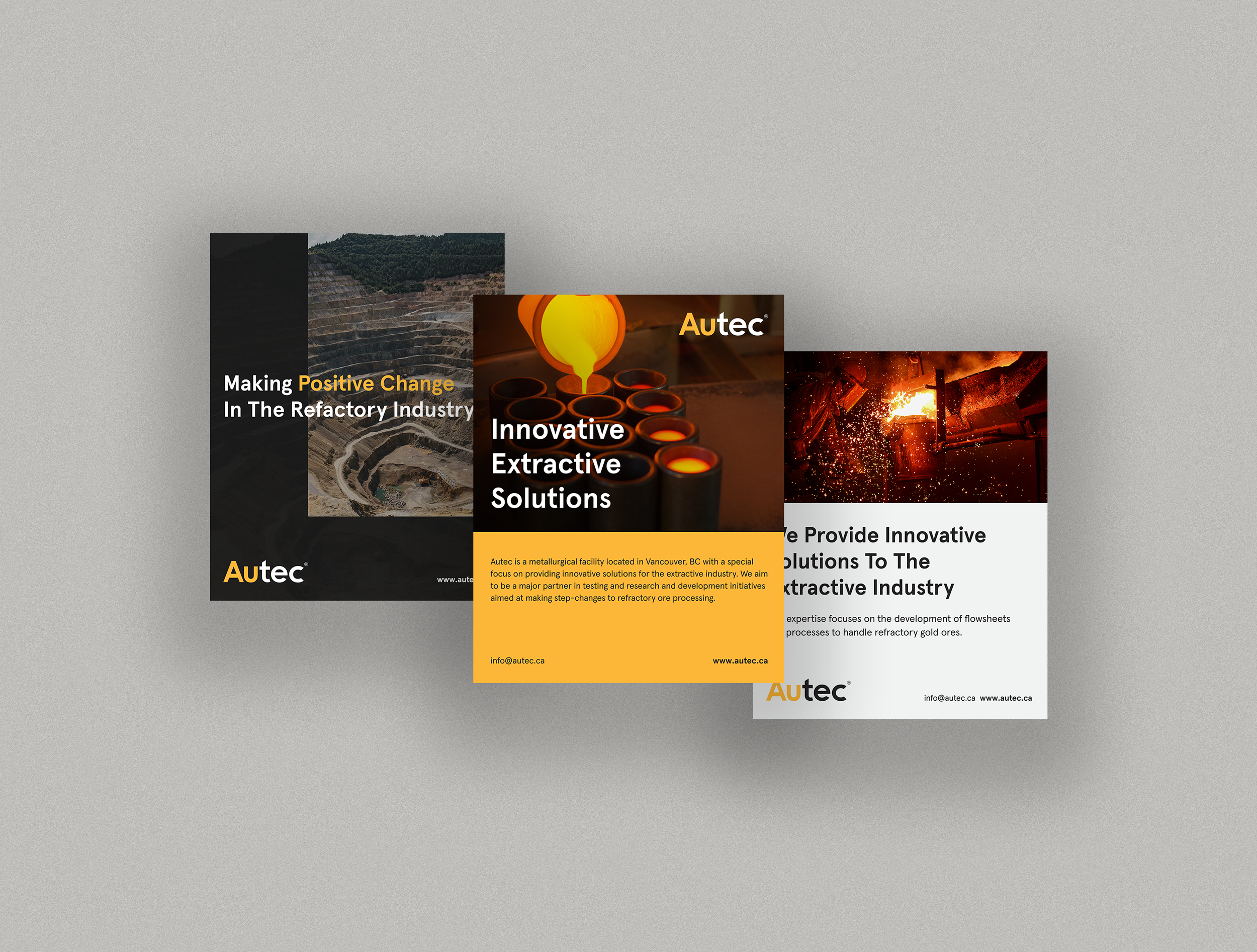
Print Collateral (Posters, Business Cards, Lanyards)
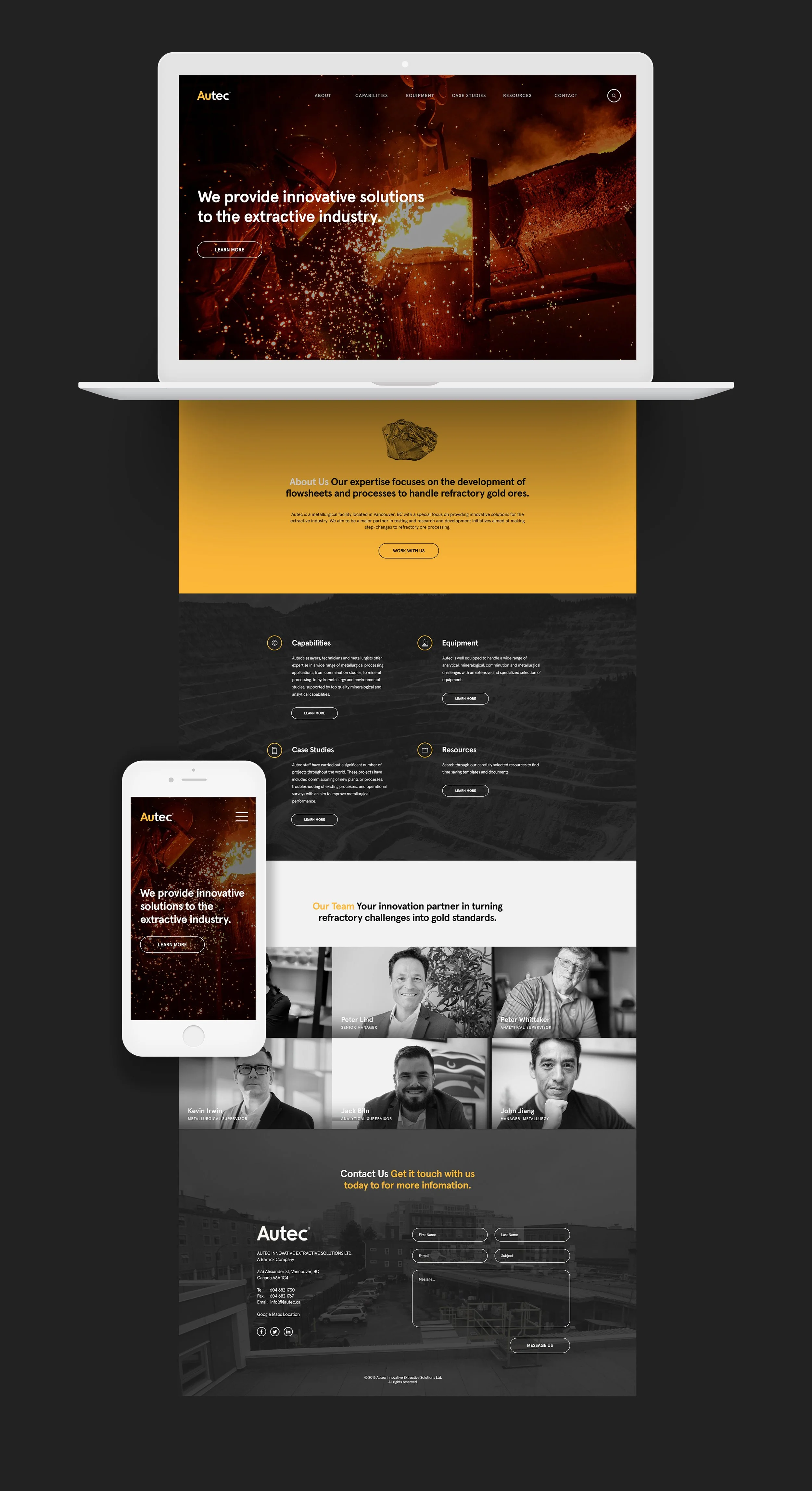
Landing Page
More From Branding & Identity